Designing a data monitoring MVP for a program integrity and audit team
Interaction Design, UX Research
2025
Product Designer
I was the primary designer for the Wave Watch MVP, a proactive data monitoring tool
I designed the MVP of a self-service data monitoring and notification experience for a federal oversight organization with a more than $1 trillion portfolio that needed to provide oversight on taxpayer dollars. I worked with a team of 5 data engineers and full stack developers to help users gain visibility into potential leads for investigation without having to have an expert level understanding of available datasets and data analysis.
Note: Certain aspects of this case study are restricted due to security considerations. The work is shown here reflects real constraints, stakeholder collaboration, and design tradeoffs, without exposing sensitive information. Some details including application names and labels have been anonymized or modified.
Problem
To ensure taxpayer dollars are only used for authorized purposes, the team at this federal organization needed a way to more quickly spot and address spending anomalies through either preventative or corrective actions.
Solution
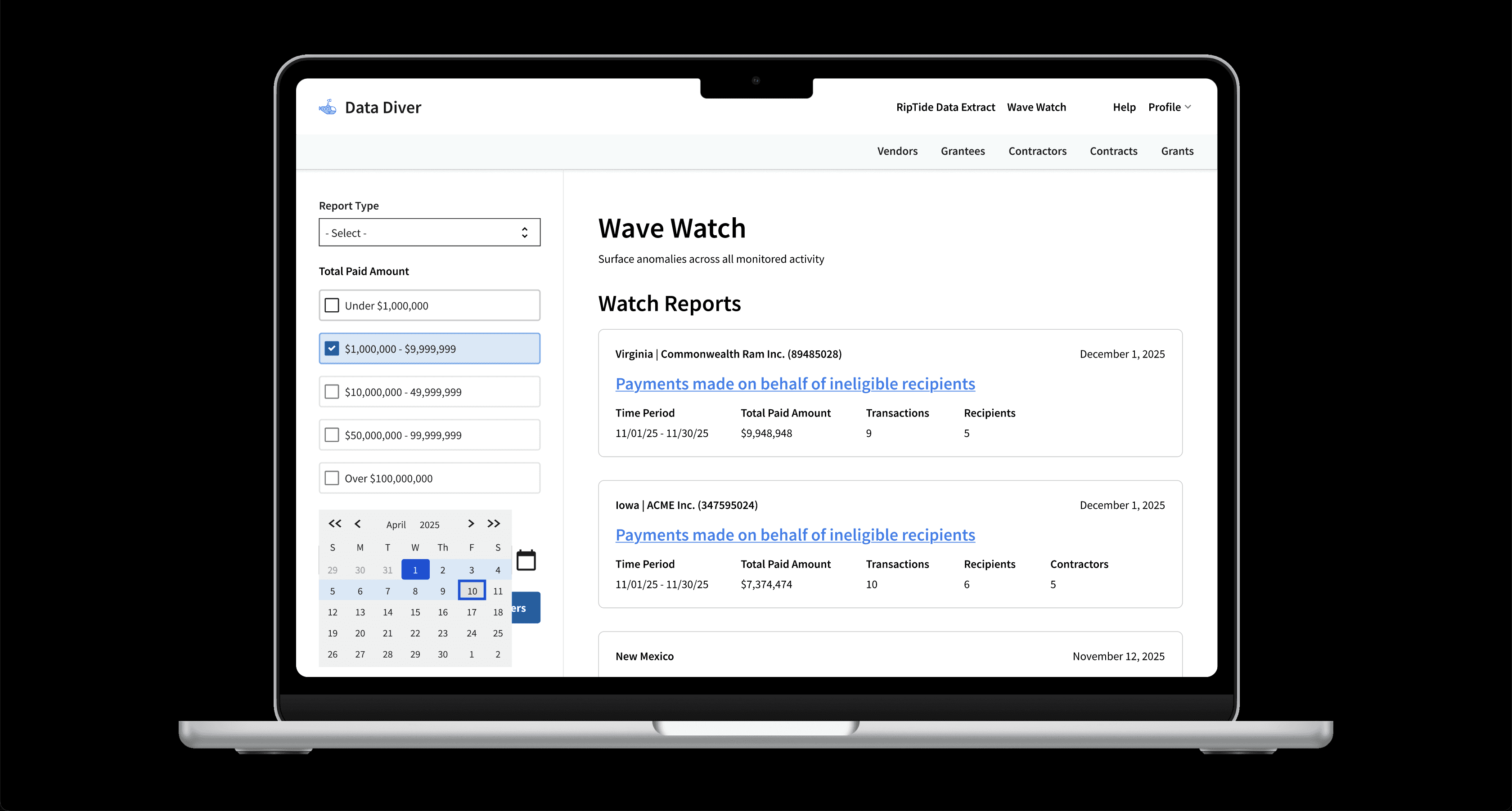
Wave Watch aggregates datasets and shows users instances where important data passes a predetermined threshold indicating an anomaly.
Focus Areas
Government, Data Monitoring or Analysis
Wave Watch increased users' bandwidth by synthesizing and analyzing data for them, effectively reducing labor costs through automation
More seasoned data analysts didn't need to synthesize data for other users. Instead they could focus on more complex and nuanced data analysis projects.
Auditors and senior leadership didn't need to have technical experience to pull and synthesize these disparate sources of data. Instead the system did it for them.
Challenges I encountered
The team's initial assumption when I joined was that users research the contractor that received payments on behalf of ineligible individuals. This was a crucial assumption, which would impact our development and design time.
After confirming the team had understandably made an assumption, I did some desk research to see if this did match our users’ mental models. Specifically, I searched the agency's public audits on this topic, which indicated how the audit topic was selected.
Mostly the auditors never researched the individual contractor as our product team assumed. Rather the auditors researched individual states and the money they gave to any contractor in that state.
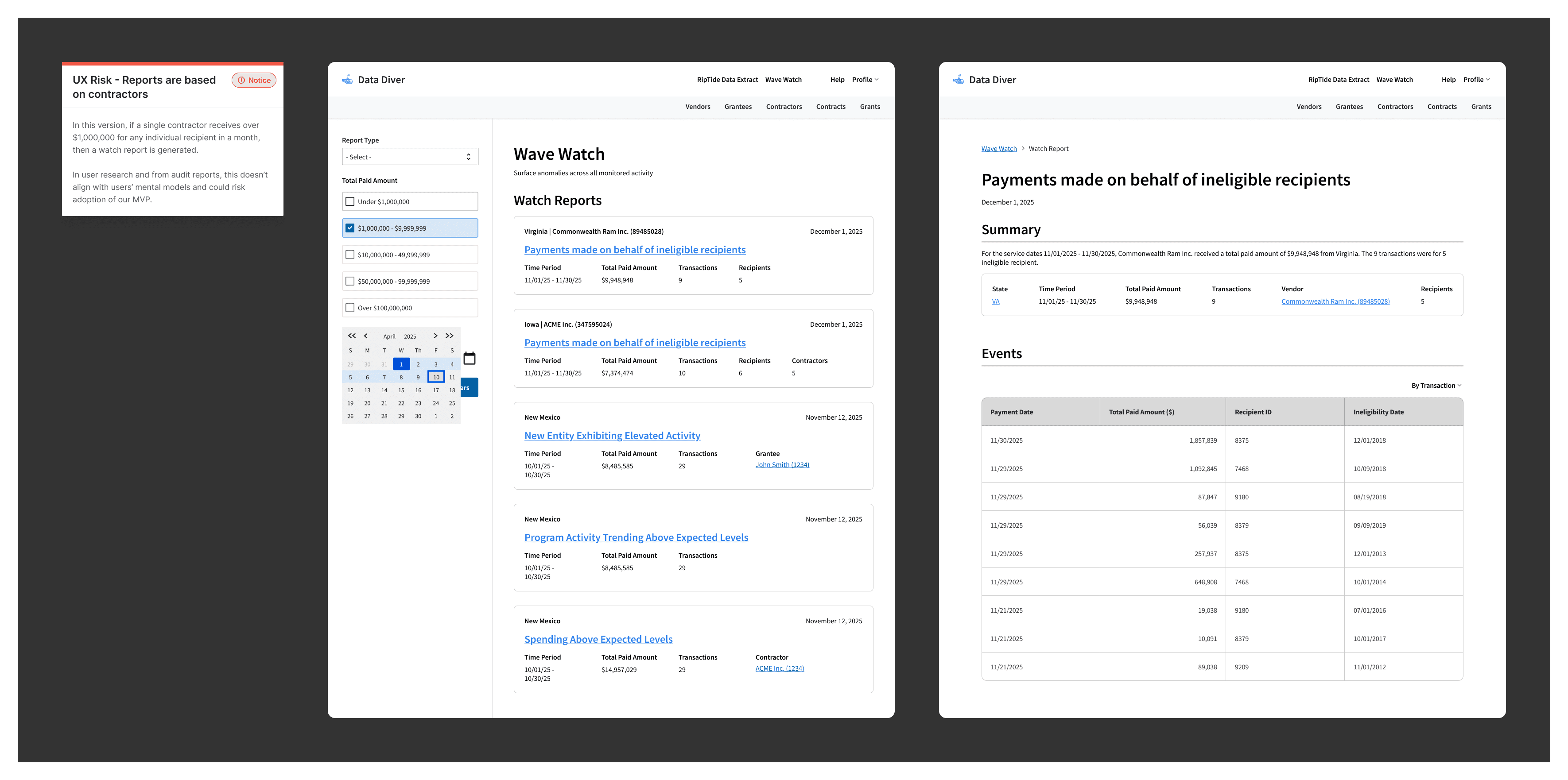
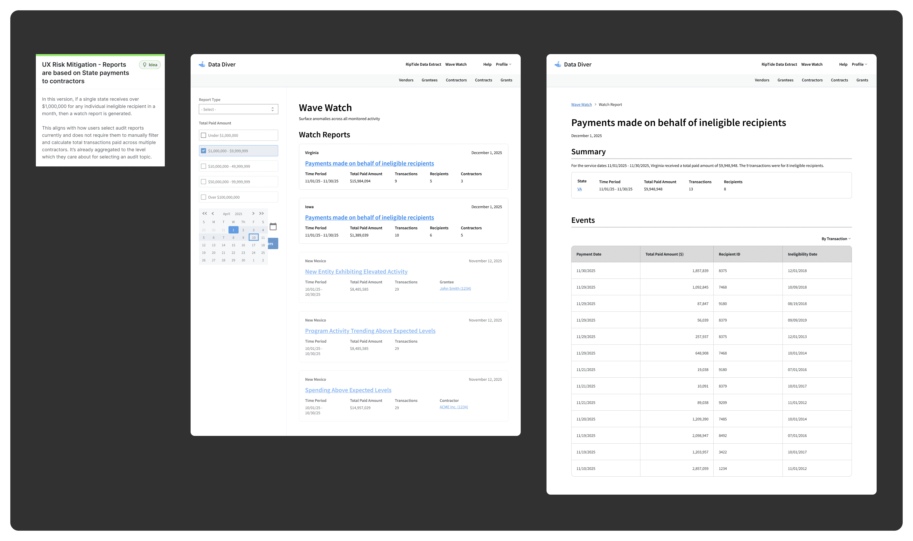
During low-fidelity design work, I documented this misalignment with users' mental models in team artifacts as well as presenting the issue with team members including our product management team and the data engineering team.
Instead of only communicating the problem, I showed an example of what an improved design could look like. During the usability studies I planned and facilitated before backend development, I used two versions of report designs to identify our core users' preference: reports built around the contractor and/or the state.
Most preferred the version I initiated - the designs based around the individual state rather than the state's contractor.
Impact
Raising this concern was important so that our team could be more intentional in the future about how we structure individual reports. Our team became more aware of the levels at which users would need information calculated. Just because we could aggregate information at certain levels, like at a contractor level, did not mean it necessarily added value - it could in fact, add undue burden.